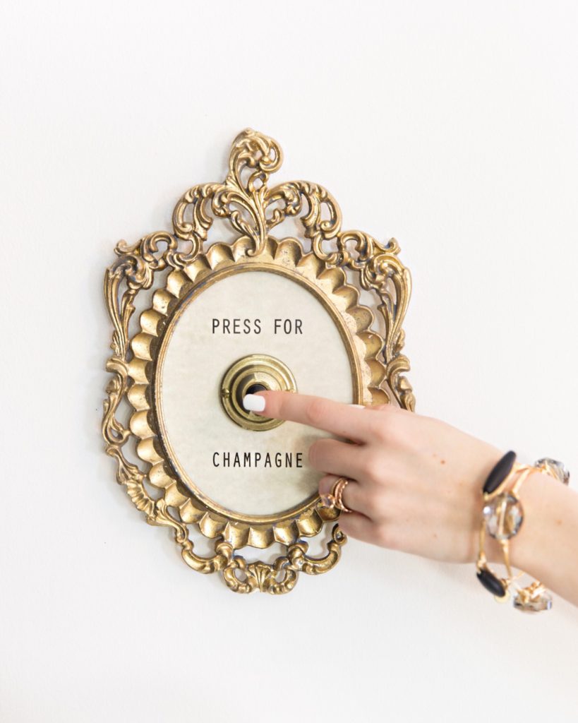
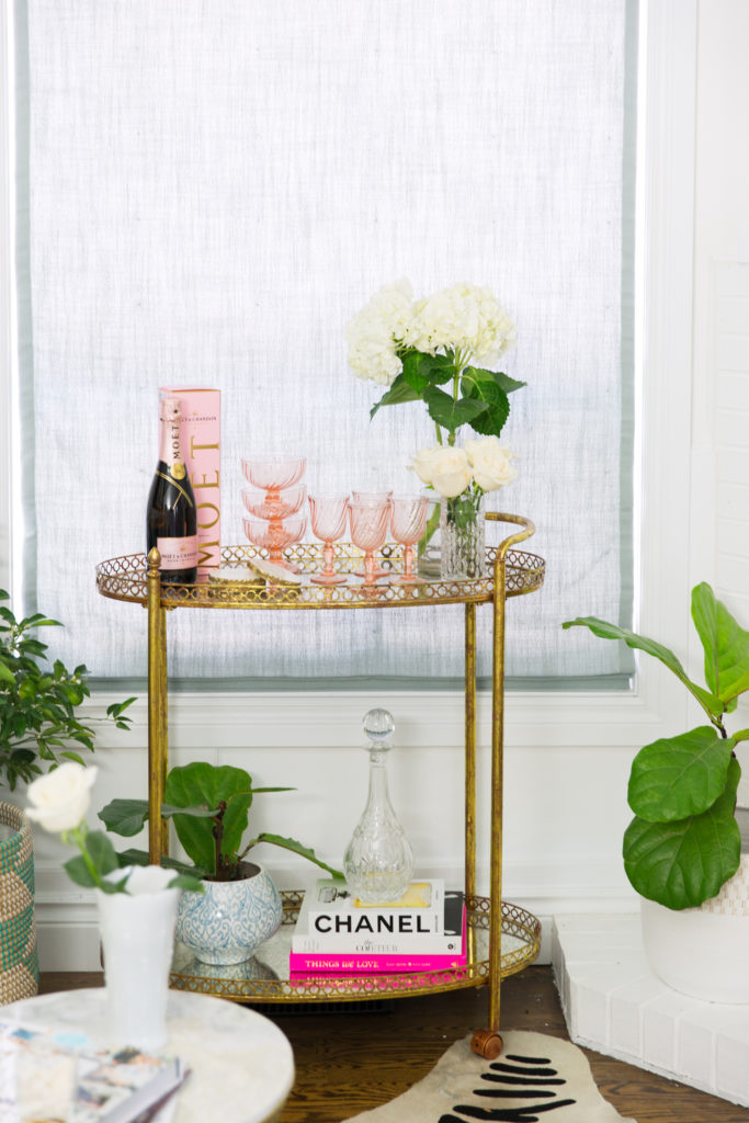
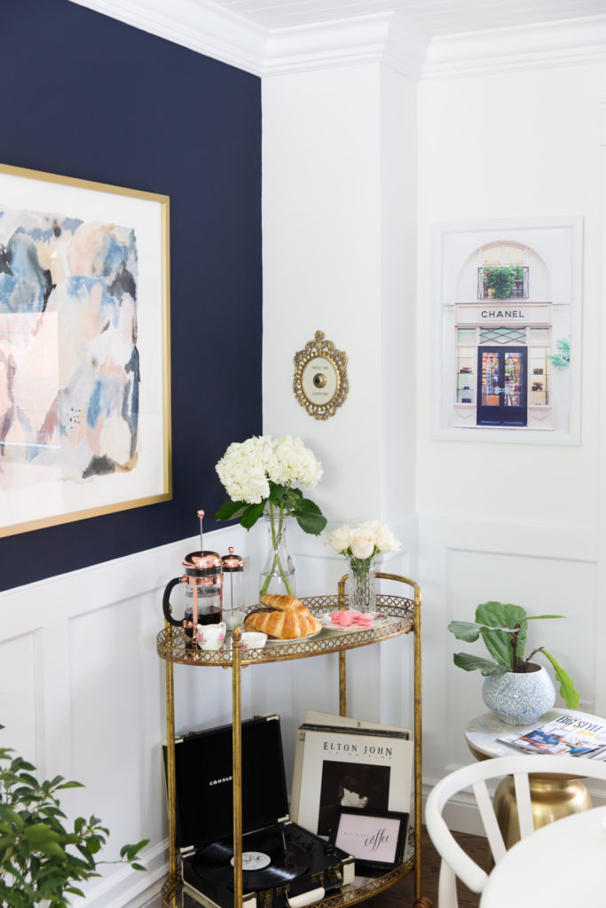
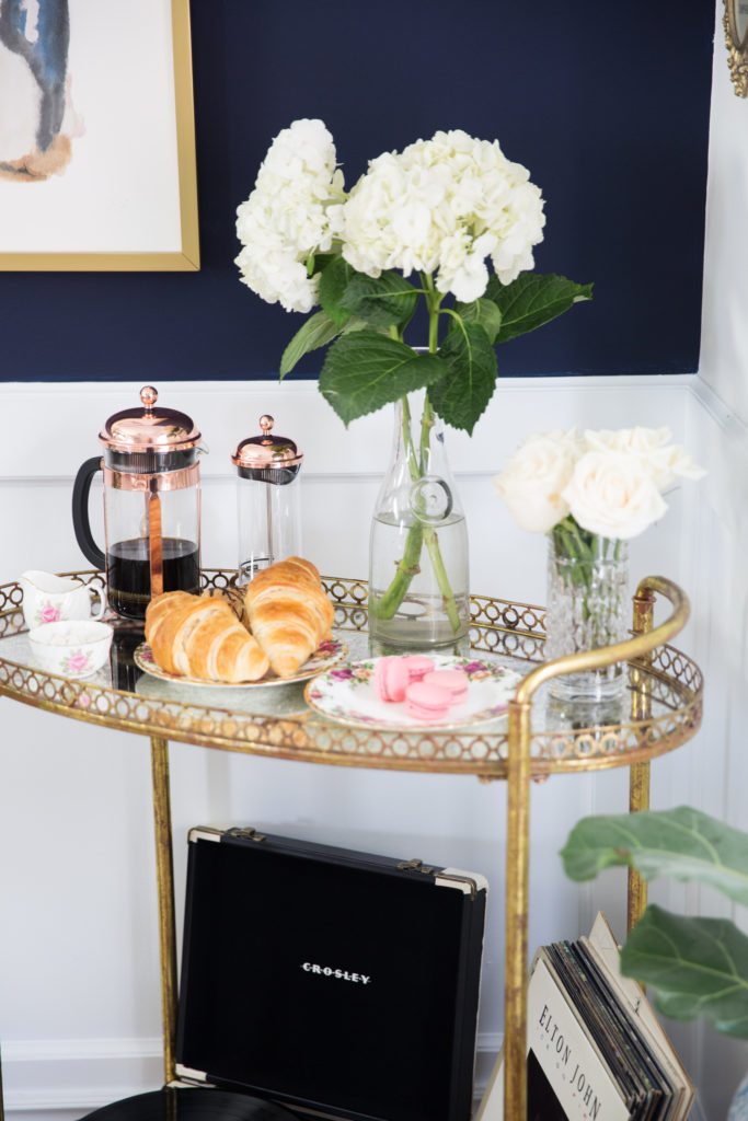
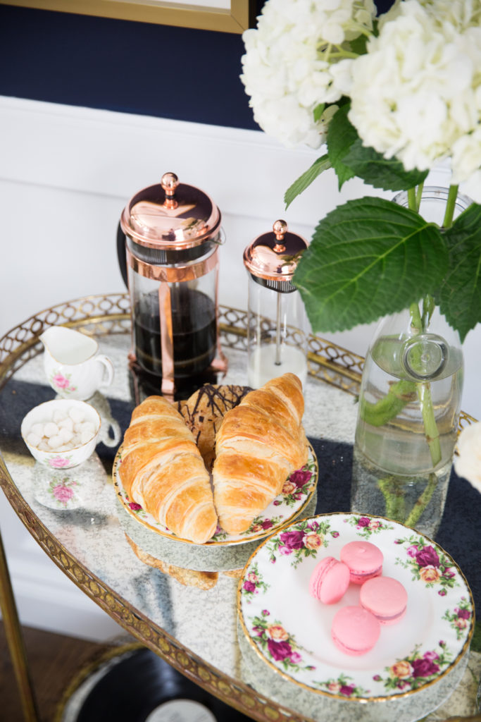
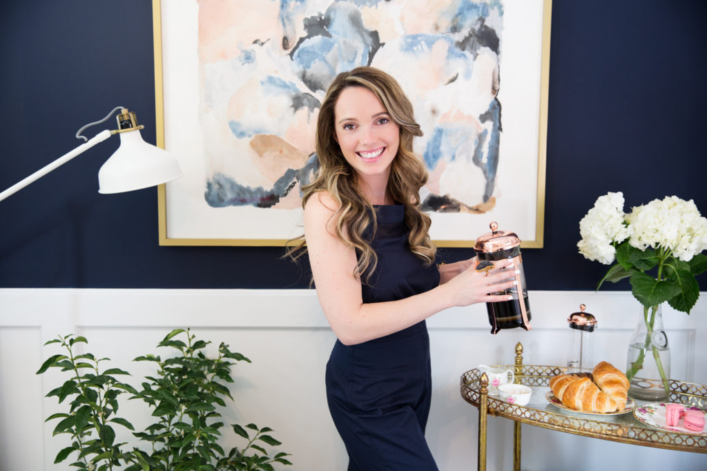
In my world a bar cart is always a good idea, it can be used in SO many different ways in design & of course I kept my ‘Press for Champagne’ sign nearby too for those brunch mimosas! I am also SO in love with my new Bodum copper french press set, the matching coffee cups are LOVED by our brunch guests!
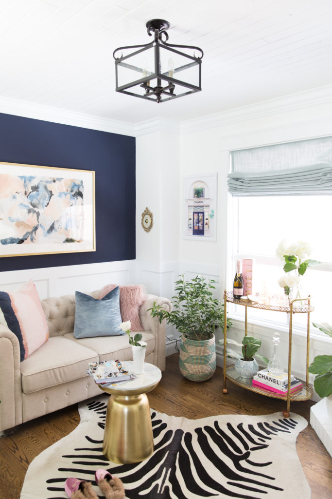
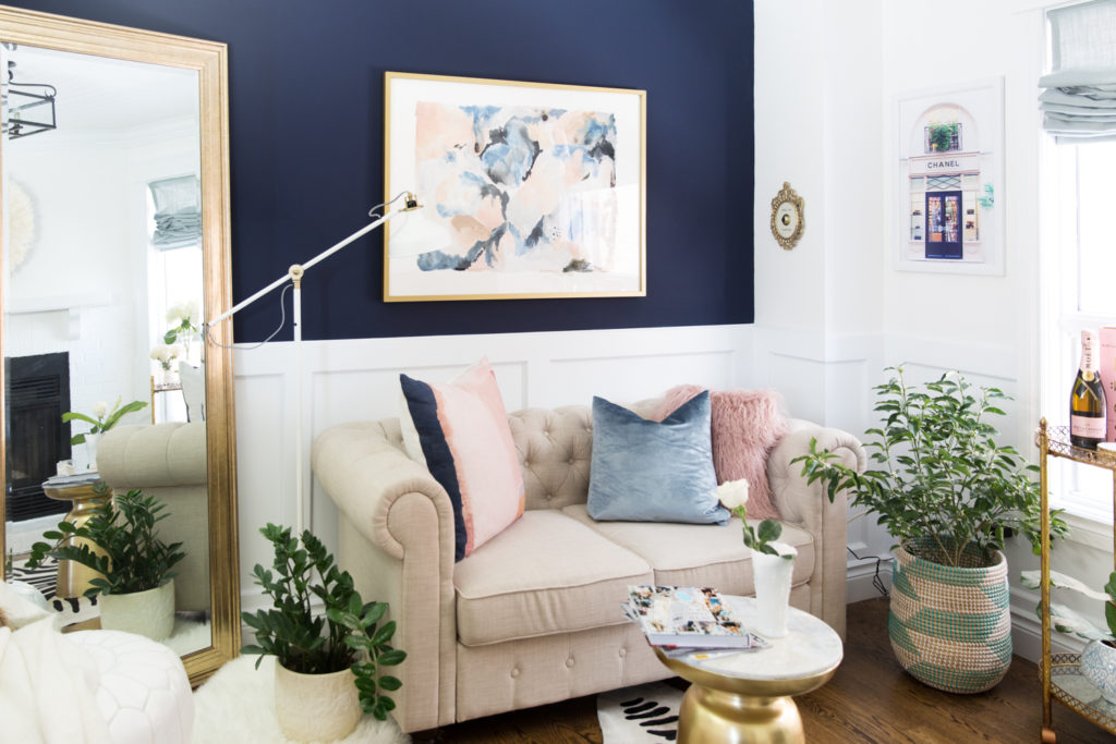
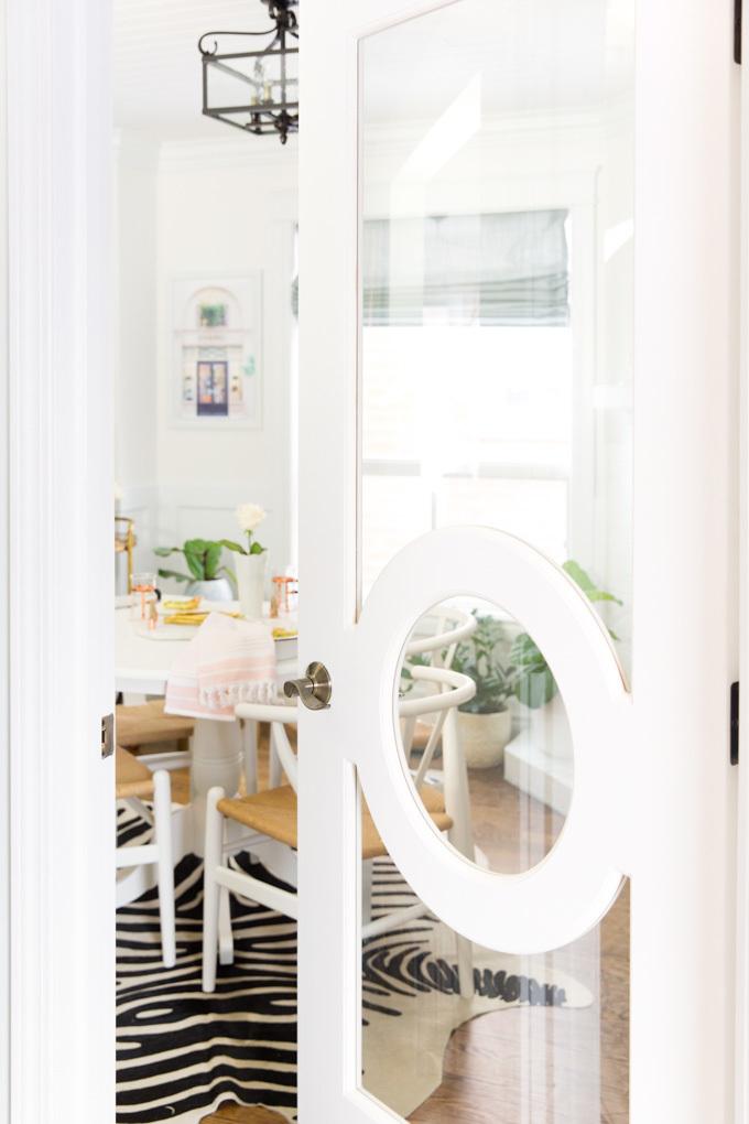
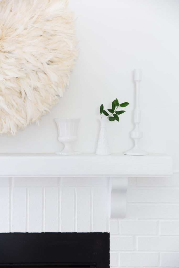
This 100 square foot room was a world of it’s own, with an awkward shape and odd corners it took 3 different makeovers in two years for me to finally feel content with the final product. We actually just sold the home a month after I finished this space and the person who bought it was in love with the premise of being able to use is as an office and dining space. We styled this space 2 ways for you with Joss & Main and I am thrilled with how both ways turned out! I am a stay at home mother of 2 who also works from home so I needed an office badly while living in this house but the only additional space we had was considered the dining room. We did a beautiful DIY in the kitchen by adding a dining space there with a built in bench for seating and with little square footage on our main floor we decided we could turn this “dining room” into a room for my blog work & meetings while also making it easy to quickly transform it into a formal dining space when needed (or to show to potential buyers a formal dining room when selling). We started by updating the fireplace with a quick white paint job, it took an afternoon to cover up the black and white stripes I had meticulously painted up there when we first moved in during a Kate Spade dressing room obsession (4 coats needed there lol) and then to cover up the porous salmon coloured brick (ick)! A fresh coat of paint is such a quick and inexpensive way to change a space, this room was an awful green when we moved in and with the 4th wall being a half wall to the hallway I knew a clean white would open the space and bounce the light coming in from the front entrance and the large window, making the space feel larger than it was (and making for better photos for my work). Adding in this gorgeous Fashion Forward Metrie glass door was another way to elevate the space and make sure more light could pour through. We didn’t change the flooring as this house already had original hardwood flooring in excellent condition, not the colour I would have picked myself but when flipping a house you truly have to pick and chose where you are spending your money and what will return on your investment. Popcorn ceiling is my biggest dislike in homes, we wanted a quick and inexpensive way to cover it up without spending an entire weekend scraping it off!! Tongue & groove by Metrie trim & moulding was our go-to and something we had done in 3 other spaces of this home so we were familiar and it was quick to get it up, it really paired nicely with the wainscotting we did on the walls. The space was instantly transformed with a coat of paint and the trim and moulding work! Adding in a tall leaning floor mirror also helped to open the space up and make it seem larger, it also makes for a great selfie spot I won’t lie ;). Pick items for this space that could be moved around vs adhered to the walls was key, the mirror, the bar cart and the shelving can all be moved to change the space to suit.
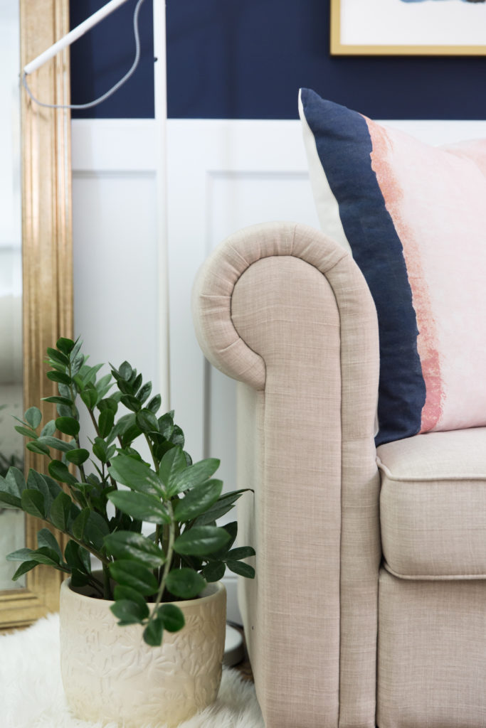
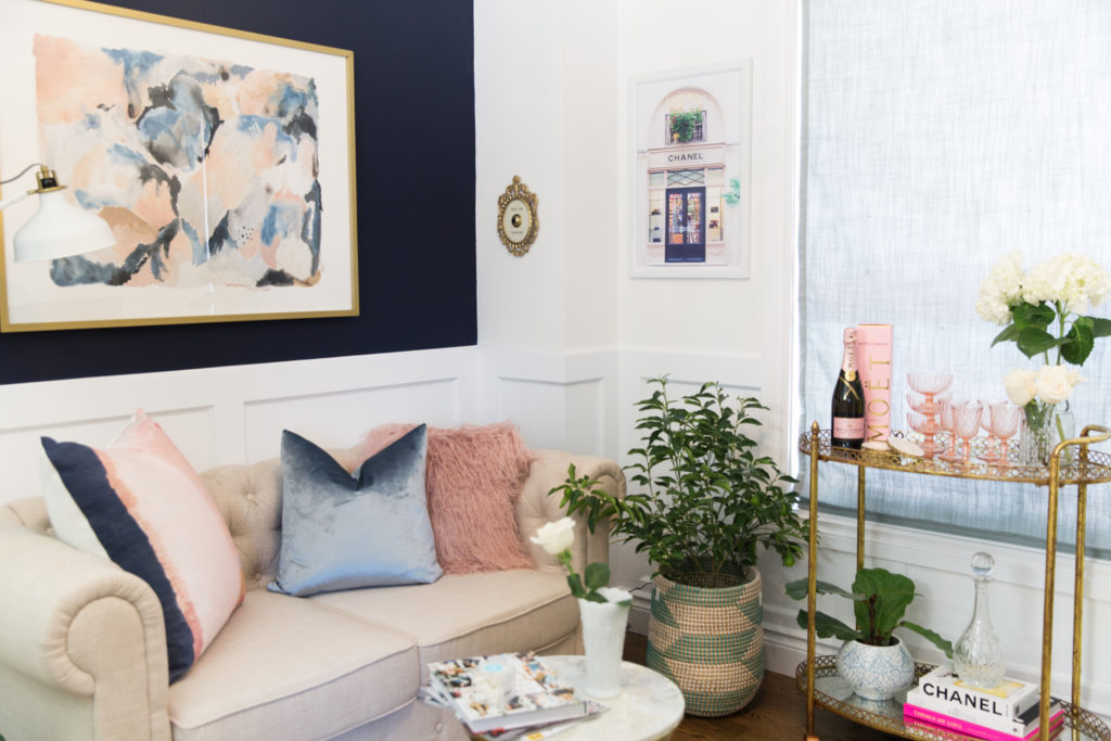
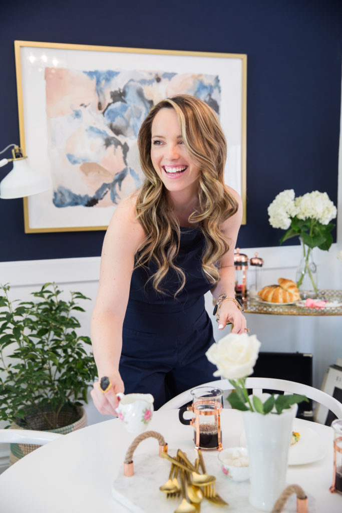
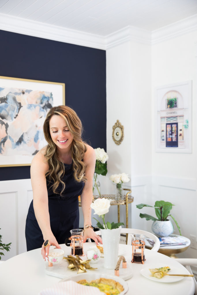
Finding a rug for this space was challenging do to the shape of the room, the angled fireplace prevented us from going with a square or rectangle traditional rug and so I decided to go with a faux zebra – I was hesitant at first to pull such a print into the space since I tend to gravitate towards neutrals only (ahem, the white wool braided rug trend) but I am so happy that I went for it! It pairs perfectly with the look of sharp brass pieces on a dark wall. I was desperate to get this navy Benjamin Moore paint colour on a wall somewhere in this house after seeing it in a friends house on their kitchen island, in order to keep the space from looking smaller than it already was I kept the darker paint to one wall only and since it was only going on the top half because of our wainscotting I knew it would look great, I had already picked up a brass floor mirror and some art from Minted plus a super cute “Press for Champagne” sign off of Etsy (that rings!!) that I wanted to pop off of that navy. For this space I actually pulled from the art I already owned to style the space, the entire vibe of the room is based from my craving to have a mature and elegant office while incorporating my French background. I picked up a CHANEL store front photograph from my photographer Anna’s shop {found here} and a water colour one from Minted {found here}, this space is built upon those two pieces of art. I pulled the rich navy from both of them, the clean white background with pops of metallics and colour. I am a crazy plant lady and feel that every room is incomplete without a plant (or two) – some may think I go overboard but I love how each of our spaces in our house have a greenhouse vibe to them ;)! I wanted this space to be able to switch from office to dining space with minimal changes and as you’ll see it’s super simple, all it takes is swapping a love seat for a dining table & chairs and you can style the room differently as you wish by changing up the bar cart location and it’s decor + your shelving. No one says one room can’t be used for many different things and this space is a great testament to making a dedicated work space with little square footage. The half wall you do not see actually has a vintage trunk ottoman dedicated to storage!
Both spaces are home to a lot of pinks and blues on a neutral backdrop, it is very feminine but not too intimidating to my hubby – he loves the space too! My lighting from Joss & Main {found here} and our custom window coverings by Q Design were inspired by the Chanel print, I chose an almost black and glass lighting to pull from the iron in the print, to bring a little of the streets of Paris inside and the lovely hue of blue from the store front for our linen roman shades. Picking window coverings can be tricky, we wanted something that would still let in a decent amount of light within the large window (and only window the space has). We also didn’t want to do drapery so that we could show off the beautiful wainscotting work! I am lucky that a few of my closest friends are interior designers so they helped me try to figure out the space to get it to where it is today and responded to all of my indecisive texts along the way ha ha! My friend Ashley Davidson was especially helpful as always, she brought over some vintage milk glass pieces and the lovely crystal decanter – she also brought over that amazing printed euro throw pillow and the candle sticks.
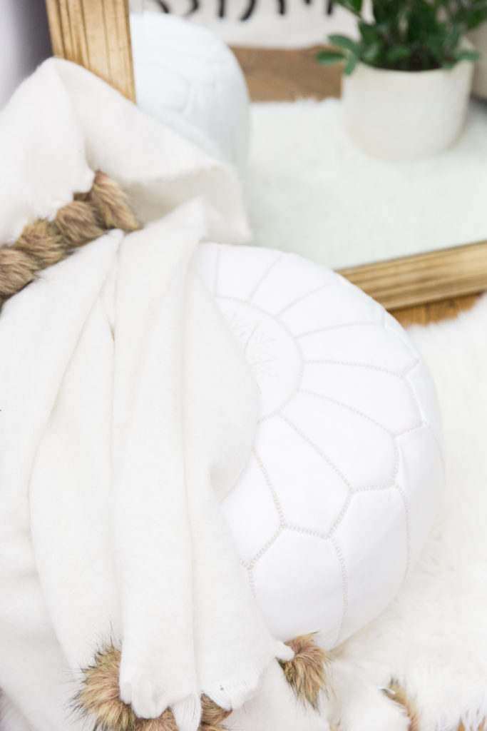
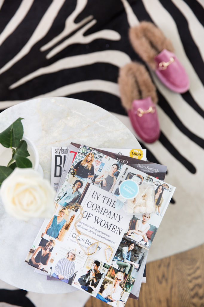
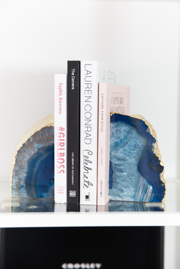
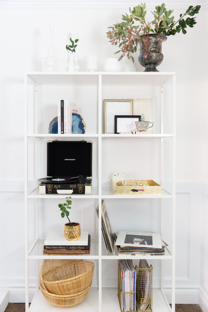
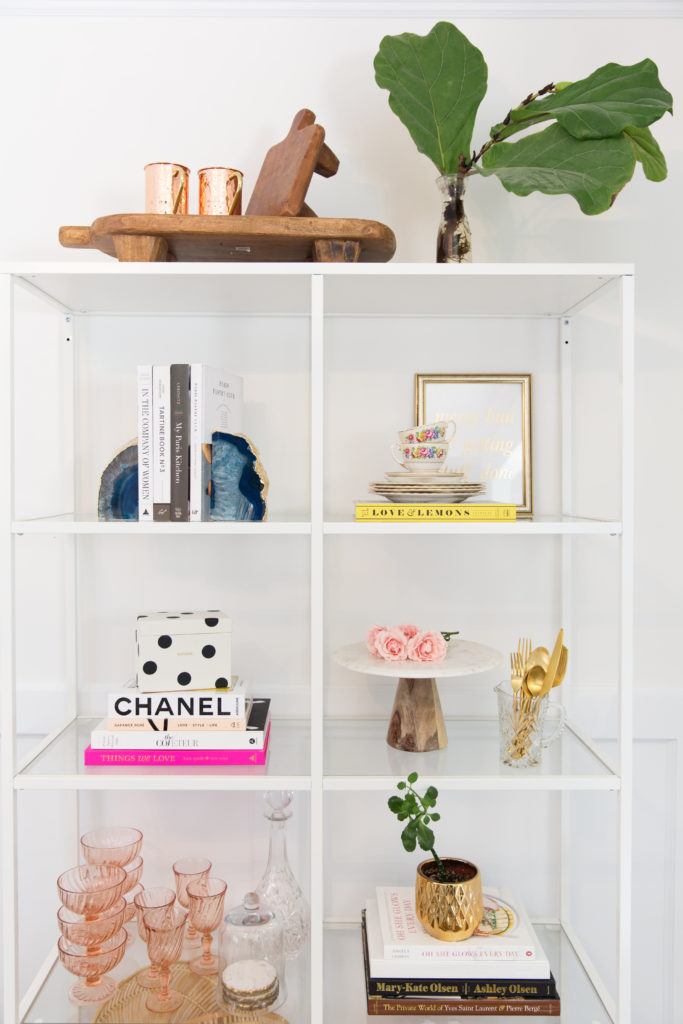
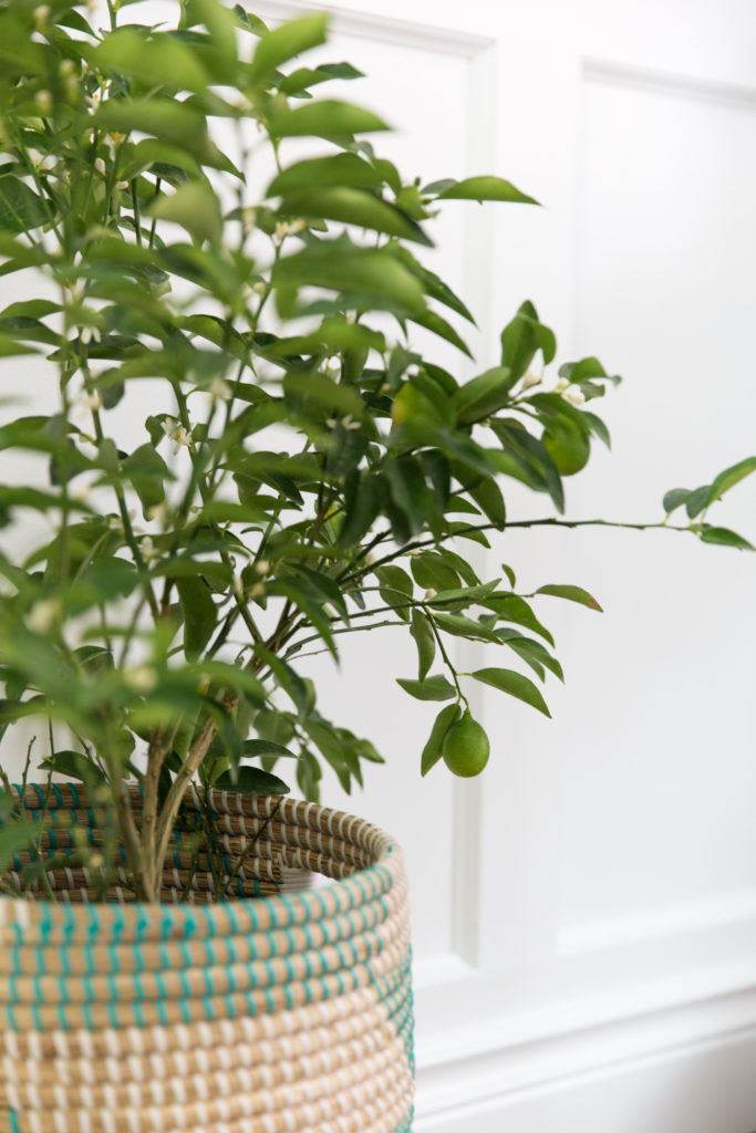
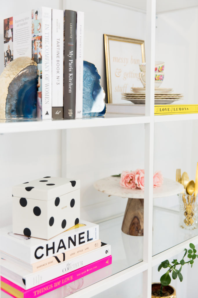
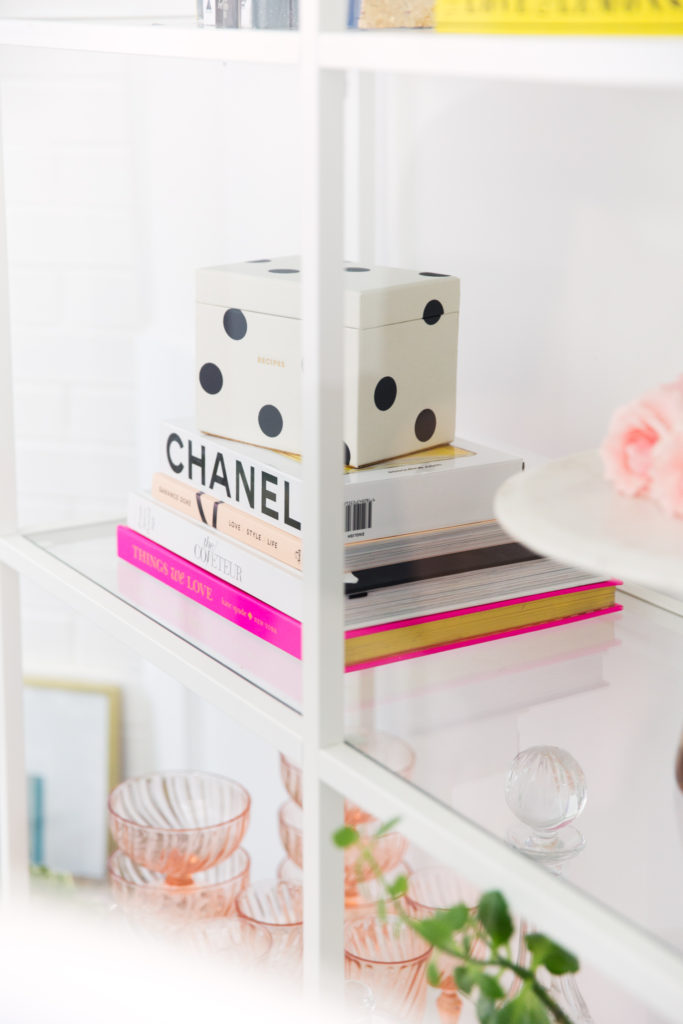
For the office…I wanted a small amount of seating, enough for me to comfortably relax and get some work done or light reading but a space I could also entertain a meeting in with a couple of guests, where we could enjoy a cup of coffee (or glass of champagne) and discuss upcoming projects! Adding in some moroccan poufs or cute faux fur stools is a great way to incorporate more seating without having more large pieces of furniture! Ashley Davidson helped me style the shelves by cleaning out some of my clutter and then I took over and made it more “me”. I wanted my record player on display in the space, a record player in an office adds a level of sophistication in my opinion – it kept this space from being too “girly” and it’s a great way to show your style and personality, you can tell a lot about someone by their taste in music! I kept my pops of brass and pink in the space from books to vintage French glassware and a nice bottle of Moet champagne, and of course the pillows….I have a pillow obsession and could have easily gone overboard! Ashley picked up this print one and I paired it with a blue velvet one & fluffy pink one I found. When you are like me and your style is very mixed it isn’t a bad thing, of course it can make it more difficult at times to make decisions but can end up giving you such a fun space in the end! The bar cart is one of my favourite pieces for this space and can be such a useful and pretty source for storage, stacked books or glassware – you can even use it for makeup displays, antique finds or if you’re a greenthumb like me, fill them with a variety of plants! This bar cart is on wheels so we can move it around to suit the needs of the room and sticking my lime tree next to it seemed so fitting – a handy plant to have close when mixing cocktails that are in need of some citrus. This rug is SO easy to quickly roll up and remove or move around the space too, it is lightweight but also adds a warmth too and I love a hide by a fireplace! It easily works for a sitting room or dining space and it’s so easy to quickly wipe anything up off of it, trust me – with two toddlers I know from experience! Our white & glass shelving was a great way to keep some of my office pieces organized and it’s a piece of furniture that isn’t too chunky or invasive, my record player as well as some of my favourite fashion & design books and stacks of magazines for guests to peruse during a visit. It was important to me to keep this space looking clean and elegant but also not to lose my personality and functionality. If you are needing more storage I suggest a storage ottoman as a coffee table or a nice vintage trunk with storage, I am all about discreet storage options and they are a must for small spaces to avoid piles of clutter!
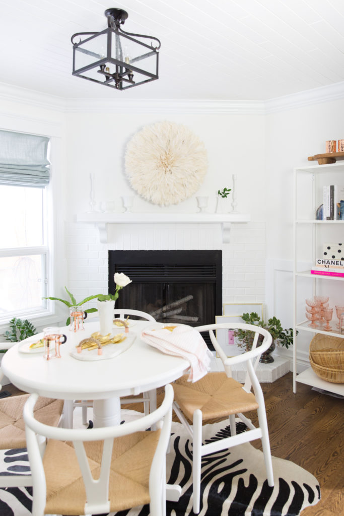
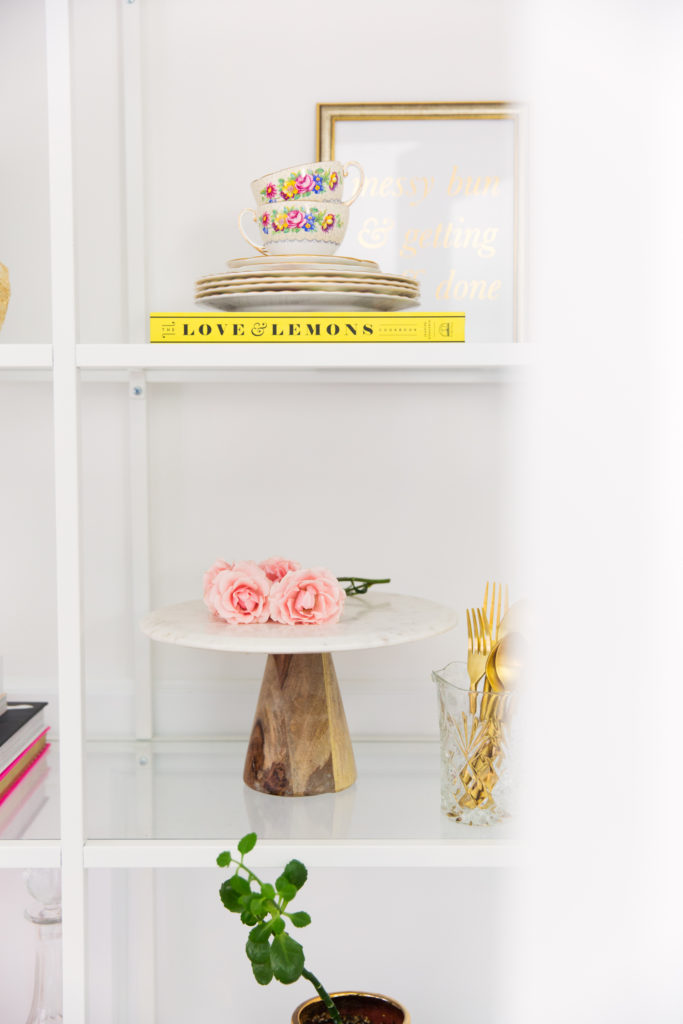
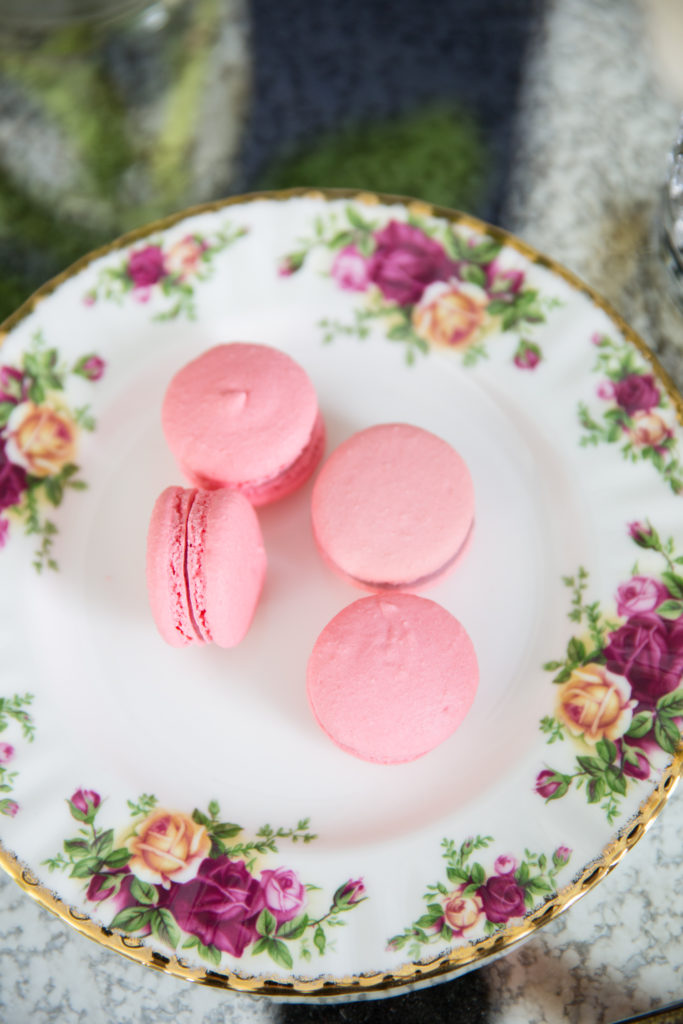
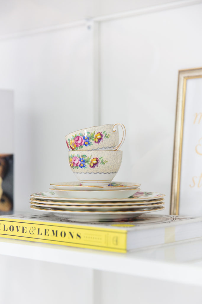
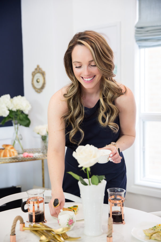
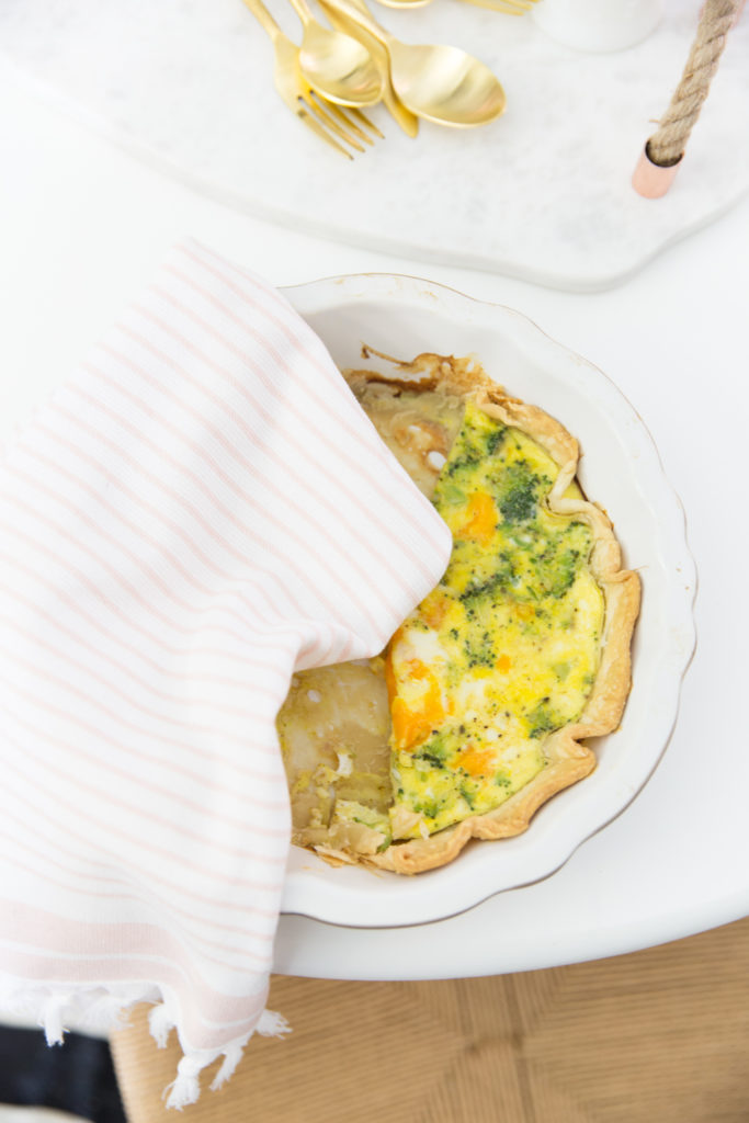
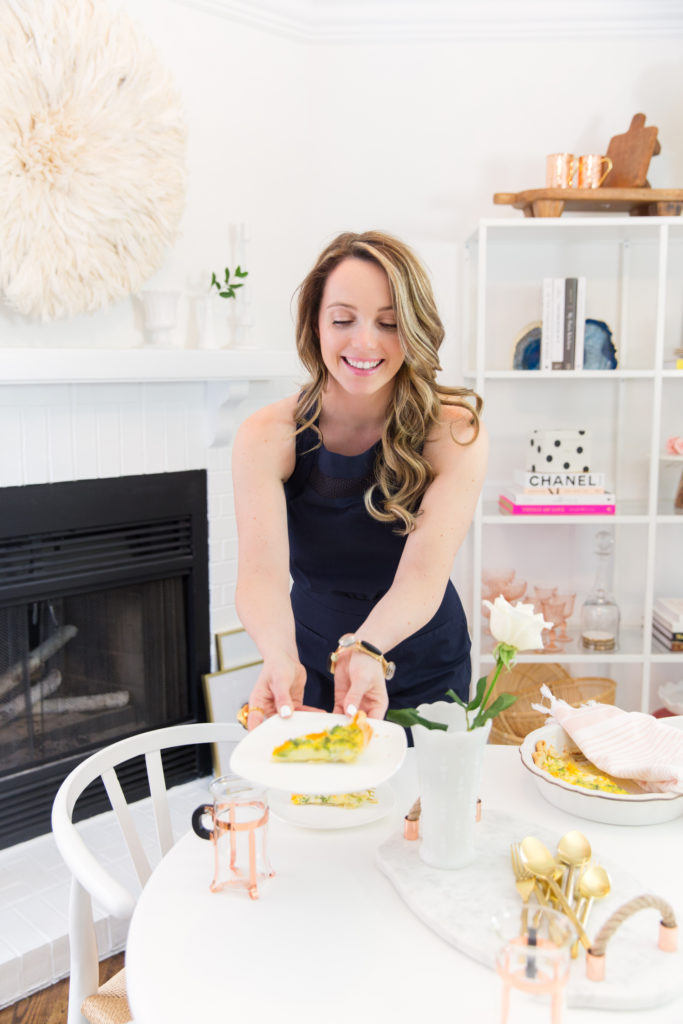
For the dining space…we pulled out the love seat and added in a lovely wood pedestal table and my wishbone dining chairs, I love the look these chairs bring into the space with their natural fiber seats – a nice way of adding in some more texture! I am often casually entertaining and this 36” round table did the trick for 4 people! I styled my shelves differently by removing the record player and adding in my favourite cook books, vintage floral tea cups, cake stands and wood trays. I also pulled my vintage French pink glassware from the bar cart and styled it into the shelving so we could change up the bar cart. Since this was for a brunch in the dining space I set up the bar cart as a coffee station with my Bodum French press and some pastries and styled the record player on the bottom shelf for some lovely music to play! By moving the bar cart to the navy wall it instantly changed the space and I love how it pops off of the that wall, of course the bar cart being nearby to the “Press for Champagne” sign is super cute too if you are a hostess like me that likes to greet every one with a fresh Mimosa. Fresh flowers throughout the space and plants of course are a great way to add life and elegance, every one appreciates fresh flowers at a table when coming over for brunch…almost as much as a fresh homemade quiche!
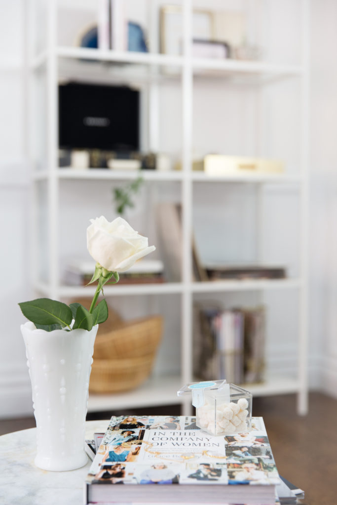
I kept the table styled nice and simple with my favourite marble and rope tray, our Bodum copper coffee cups and white dining ware with a pop of brass cutlery…because every brunch needs brass cutlery am I right? Lastly, I popped a single white rose into a lovely vintage milk glass vase to finish the table styling. All in all, we are SO happy with how “both” spaces turned out and I hope you love it as much as I do and can pull some inspiration to change a small space in your house to a more functional one! Don’t forget to be brave in your design choices and stick to what makes you happy, this space screams my style and made me smile whenever I spent time in it. As you guys know we are in limbo right now waiting for our new house to be move-in ready, I cannot wait to share all of the new spaces with you once we move in!
Sponsored by Joss & Main
Photographed by AnnawithLove
Navy Jumper: Paper Crown by Lauren Conrad Spring 2017
Ceiling, Wainscotting and office door: Metrie
Custom Roman Shades: Q Design Centre
Milk Glasses, Vintage Crystal Decanter, Printed Pillow Sourced by Ashley Davidson Design




What Benjamin Moore navy did you use? That is the color I have been looking for!
It’s called Deep Royal!!! And we’ve used Gentlemans Grey in our new house and it’s GORGEOUS!!!